A metrics & Onboarding dashboard built from the ground up
A data visualization tool that keeps admins in the loop
COMPANY
Microsoft
Microsoft
Microsoft
ROLE
Lead Designer
Lead Designer
Lead Designer
Duration
4 months
4 months
4 months
YEAR
2024
2024
2024


Project TLDR
The context
A project to build a usage dashboard and help HR and IT Admins get comprehensive insights into user telemetry and usage to ensure effective adoption and ROI within Viva Pulse
The problem
How might we help admins track user telemetry and usage to ensure that Pulse is being used effectively so that they can address usage problems and understand the value they're receiving
The goals
User
Quickly see the data needed without having to leave the app
Easily understand the data
Have guidance in solving problems when necessary
Business & Stakeholder
Unblock users that may be having issues with adoption
Be able to gather feature telemetry not available in PowerBI
Focus on core metrics in first phase
The solution
A metrics dashboard that provides data visualization on core data points across a 6-month timeframe while also providing guidance on onboarding and deployment issues
The impact
36%
Growth in users within 4 weeks of launch of feature with positive user feedback on meeting initial needs
Telemetry access
Enabled internal product team to have access to feature telemetry that wasn't available previously
Role
Lead designer
Lead designer
Duration
4 months
5 months
Team
PM
Front & backend devs
Engineering lead
01. A group effort
Users were struggling with missing metrics and guidance
Users were struggling with missing metrics and guidance
We had heard mentions from some customers about the desire for more metrics to track usage in their organizations.
Talking to customers
To drill down further, we used existing customer conversation programs. We hoped to gain insights and understand more about what problems they're currently facing, what metrics matter to them, and how they monitor their metrics currently
“ We want to know are users actually engaging with the app… are there areas that are being over or under used”
“ We want to know are users actually engaging with the app… are there areas that are being over or under used”
Pulse user, IT Admin
Pulse user, IT Admin
Some additional insights from our customers:
Need to be able to quickly see and understand the data they need
May need guidance to address certain problems
Some users may not be tech savvy
MAC (Microsoft Admin Center) can be lacking for more granular usage data
Do not want to leave the app to monitor usage
Wanted metrics related to active usage, adoption, and survey send/response rates
02. It's all about the journey
Journey mapping illustrated how users were blocked by lack of data access
Journey mapping illustrated how users were blocked by lack of data access
Getting data from users and being able to understand their needs, problems, and experiences with current solutions they use was helpful to plot their journey.
Summarized findings
Low points
Challenges with role permissions accessing MAC
Available data is limited and lacks granularity
Unable to fully diagnose why users in their org aren't using Pulse
High points
Available data helps to see basic app usage
HR/IT Admins can understand Pulse's high-level ROI
03. Feasibility & feedback
Collaboration with PM and engineering helped put the focus on product onboarding and define realistic metrics
Collaboration with PM and engineering helped put the focus on product onboarding and define realistic metrics
Using the high and low points from the journey map, I worked with the project PM to define features that could accomplish our user's goal and resolve their issues. This was a crucial step that built the foundation for the early designs to help get cross-functional buy-in.
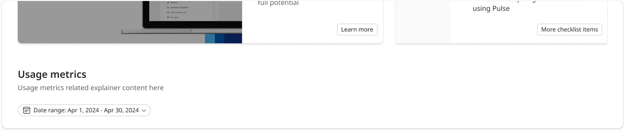
Initial design (low fidelity)
Since users of our dashboard were also users of other internal product dashboards, I looked to existing designs in other internal products to gather inspiration for what the dashboard could look like.

The data visualizations used were chosen to help users track trends and identify problem areas. A metric summary was included to give an instant overview, along with setup help.
Feedback and updates
Getting an early design in front of engineering and PM was crucial to help them understand feasibility, see how data would be displayed, and align with business goals. After review, I received the following feedback:
The metric summary was a nice to have at this stage, and the product team wanted a larger focus on adoption and deployment guidance.
Engineering had been investigating the ability to pull data for "Assigned licenses" and revealed that data couldn't be carried over from its original source in the MAC (Microsoft Admin Center)
Updated design

Updates done:
Removed metric summary and "Assigned licenses" metric and replaced with additional onboarding and help material
Clarified with PM and Engineering which metrics we could display
Added color coded % badges to each metric tile as a compromise from having to remove the metric summary
Updates done:
Removed metric summary and "Assigned licenses" metric and replaced with additional onboarding and help material
Clarified with PM and Engineering which metrics we could display
Added color coded % badges to each metric tile as a compromise from having to remove the metric summary
04. The (kinda) big reveal
Showing the designs to customers brought clarity around how they approach setup and reading metrics
Showing the designs to customers brought clarity around how they approach setup and reading metrics
Leveraging the same customer program we used previously, in addition to 1-1 meetings with a few key customers, I took the updated and high-fidelity design to validate design decisions. This allowed us to continue to move quickly while still getting actionable feedback.
User/Customer feedback
Users appreciated the simple layout of the dashboard, clear data visualization, and setup guidance
However they did point out the following:
Metric uncertainty
Some feedback given around needing help understanding how each metric was calculated and what each indicates
Expanded setup checklist
Multiple users wanted to have a more detailed checklist rather than just key points
What does this percentage mean?
Users found the percentage indicator next to each metric title confusing and unclear
No intro video
Feedback around the integrated tutorial video was mostly negative as mulitple users said they wouldn't stop to watch a video while in the dashboard
05. Just a minor setback
Discoveries on data leads to rethought design elements
Discoveries on data leads to rethought design elements
A meeting with engineering brought new constraints to light around data sourcing and data collection frequency with APIs (application programming interfaces).
This led to us not being able to include an "Active Users" metric in the dashboard and also required an update to the date filtering a user could do.
Rethinking the dashboard without "Active Users"
While the product team and I worked closely with engineering to see if there was a way to still include the Active Users, there wasn't an available workaround for this issue due to newly understood API limitations.
Although this was a setback, I discussed with the team to see if there was a middle ground on this issue. Below was our proposed solution:

An in-line video used the original space, but was viewed by users as not adding much value
The original author flow only took into account survey time and length

Users can now access the MAC directly from in-app to view both removed metrics
Rethinking date range filtering
An engineering investigation into how often we could collect data revealed that, due to constraints on not overwhelming the data retrieval system, metric data had to be collected just once a week rather than the original proposal of real-time collection.
The original date filter allowed for custom date selection with only a few guardrails
The original author flow only took into account survey time and length

A simplified way to select ranges that fits within engineering's data constraints and a "last updated" indicator so users can understand how up-to-date their data is
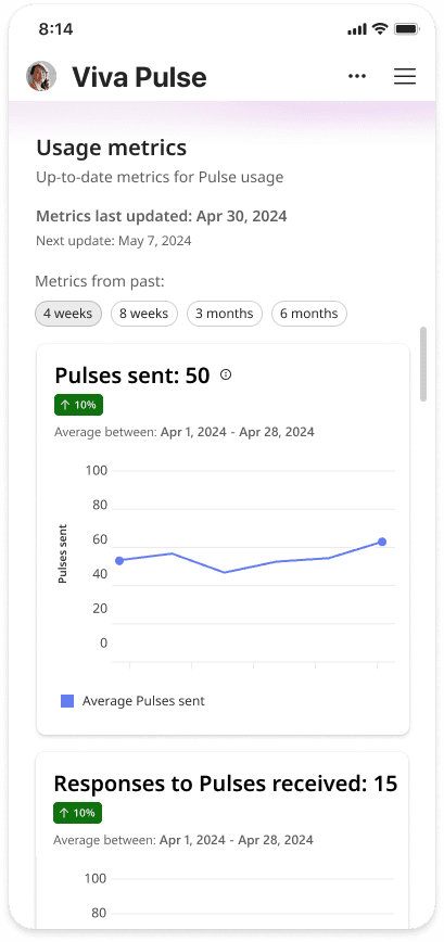
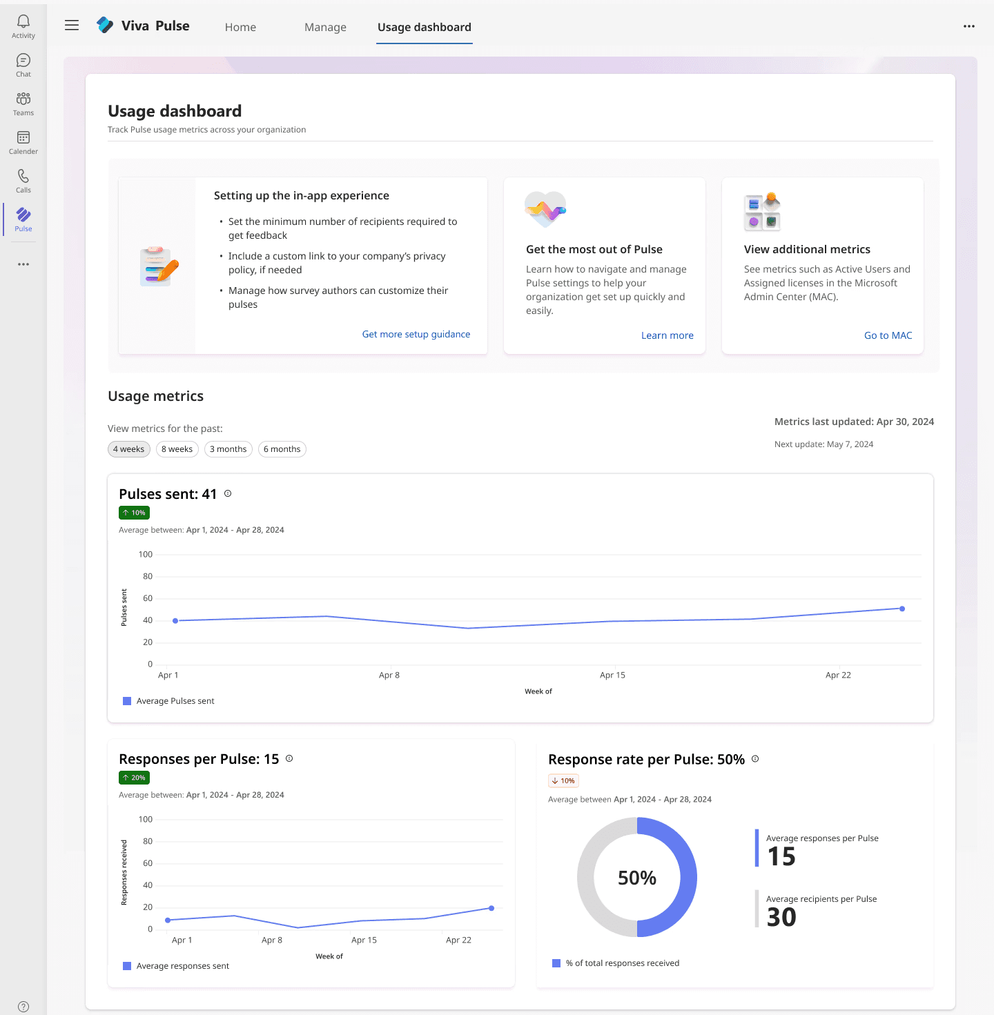
06. Coming in for a landing
Design hand off
Having adapted design elements to the new constraints, I was able to move forward with completing high fidelity screens and completing handoff processes
Below is the final design that shipped, with a recap and breakdown of certain sections:


Revised to adapt to data-based constraints
Additional space was added to guide users to where Active Users and Assigned Licenses is stored.
Date filtering was updated to have fixed timeframe filtering and text was added to keep users in the loop about the freshness of their data
Repositioned UI
The second most requested metrics "Pulses sent" was prioritized to have a greater visual hierarchy in place of removing "Active Users"
Percent indicator badges were moved to improve readability


Informative tooltips & hover states
To improve user comprehension of badges and metrics, explainer text and tooltips were added. These were written in conjunction with the content design team, to ensure to-the-point but sensical guidance.
06. Coming in for a landing
Design hand off
Having adapted design elements to the new constraints, I was able to move forward with completing high fidelity screens and completing handoff processes
Below is the final design that shipped, with a recap and breakdown of certain sections:

Revised to adapt to data-based constraints
Additional space was added to guide users to where Active Users and Assigned Licenses is stored.
Date filtering was updated to have fixed timeframe filtering and text was added to keep users in the loop about the freshness of their data
Repositioned UI
The second most requested metrics "Pulses sent" was prioritized to have a greater visual hierarchy in place of removing "Active Users"
Percent indicator badges were moved to improve readability

Informative tooltips & hover states
To improve user comprehension of badges and metrics, explainer text and tooltips were added. These were written in conjunction with the content design team, to ensure to-the-point but sensical guidance.
07. Looking back
Reflections
Reflections
Thank you for going through my second case study. If you've already read my first one on the survey content management tool, awesome! If you haven't and have some extra time, please feel free to visit that case study
Below are some moments that stood out to me during this project:
Reflections
Updating the design later in the project was a great lesson in understanding that unexpected speed bumps like data constraints happen. While I think pushing for clarity with engineering more frequently would have helped, it taught me how to be adaptable and how to collaborate on a solution to push forward through setbacks.
While time to conduct a structured usability test instead of simply getting group user feedback with fixed screens would have been ideal, I felt the info gathered was strong enough to move forward and had to consider the product team's timeline, along with engineering's time to implement
02. It's all about the journey
Journey mapping illustrated how users were blocked by lack of data access
Getting data from users and being able to understand their needs, problems, and experiences with current solutions they use was helpful to plot their journey.
Summarized findings
Low points
Challenges with role permissions accessing MAC
Available data is limited and lacks granularity
Unable to fully diagnose why users in their org aren't using Pulse
High points
Available data helps to see basic app usage
HR/IT Admins can understand Pulse's high-level ROI
03. Feasibility & feedback
Collaboration with PM and engineering helped put the focus on product onboarding and define realistic metrics
Using the high and low points from the journey map, I worked with the project PM to define features that could accomplish our user's goal and resolve their issues. This was a crucial step that built the foundation for the early designs to help get cross-functional buy-in.
Initial design (low fidelity)
Since users of our dashboard were also users of other internal product dashboards, I looked to existing designs in other internal products to gather inspiration for what the dashboard could look like.
The data visualizations used were chosen to help users track trends and identify problem areas. A metric summary was included to give an instant overview, along with setup help.
Feedback and updates
Getting an early design in front of engineering and PM was crucial to help them understand feasibility, see how data would be displayed, and align with business goals. After review, I received the following feedback:
The metric summary was a nice to have at this stage, and the product team wanted a larger focus on adoption and deployment guidance.
Engineering had been investigating the ability to pull data for "Assigned licenses" and revealed that data couldn't be carried over from its original source in the MAC (Microsoft Admin Center)
Updates done:
Removed metric summary and "Assigned licenses" metric and replaced with additional onboarding and help material
Clarified with PM and Engineering which metrics we could display
Added color coded % badges to each metric tile as a compromise from having to remove the metric summary
04. The (kinda) big reveal
Showing the designs to customers brought clarity around how they approach setup and reading metrics
Leveraging the same customer program we used previously, in addition to 1-1 meetings with a few key customers, I took the updated and high-fidelity design to validate design decisions. This allowed us to continue to move quickly while still getting actionable feedback.
User/Customer feedback
Users appreciated the simple layout of the dashboard, clear data visualization, and setup guidance
However they did point out the following:
Metric uncertainty
Some feedback given around needing help understanding how each metric was calculated and what each indicates
Expanded setup checklist
Multiple users wanted to have a more detailed checklist rather than just key points
What does this percentage mean?
Users found the percentage indicator next to each metric title confusing and unclear
'No thanks' to intro video
Feedback around the integrated tutorial video was mostly negative as mulitple users said they wouldn't want to watch a video while in the dashboard
05. Just a minor setback
Discoveries on data leads to rethought design elements
A meeting with engineering brought new constraints to light around data sourcing and data collection frequency.
This led to us not being able to include an "Active Users" metric in the dashboard and also required an update to the date filtering a user could do.
Rethinking the dashboard without "Active Users"
While the product team and I worked closely with engineering to see if there was a way to still include the Active Users, there was no workaround for this.
Although this was a setback, I discussed with the team to see if there was a middle ground on this issue. Below was our proposed solution:
The original author flow only took into account survey time and length
Users can now access the MAC directly from in-app to view both removed metrics
Rethinking date range filtering
An engineering investigation into how often we could collect data revealed that, due to constraints on not overwhelming the data retrieval system, metric data had to be collected just once a week.
The original author flow only took into account survey time and length
A simplified way to select ranges that fits within engineering's data constraints and a "last updated" indicator so users can understand how up-to-date their data is
06. Coming in for a landing
Final design hand off
Having adapted design elements to the new constraints, I was able to move forward with completing high fidelity screens and completing handoff processes
Below is the final design that shipped, with a recap and breakdown of certain sections:
Revised to adapt to data-based constraints
Additional space was added to guide users to where Active Users and Assigned Licenses is stored.
Date filtering was updated to have fixed timeframe filtering and text was added to keep users in the loop about the freshness of their data
Repositioned UI
The second most requested metrics "Pulses sent" was prioritized to have a greater visual hierarchy in place of removing "Active Users"
Percent indicator badges were moved to improve readability
Informative tooltips & hover states
To improve user comprehension of badges and metrics, explainer text and tooltips were added. These were written in conjunction with the content design team, to ensure to-the-point but sensical guidance.
07. Looking back
Reflections
Thank you for going through my second case study. If you've already read my 1st one on the survey content management tool, awesome! If you haven't and have some extra time, please feel free to VISIT THAT CASE STUDY.
Below are some moments that stood out to me during this project:
Reflections
Although I did try to get designs in front of engineering as soon as possible, having to update the design later in the project shows that unexpected speed bumps like data constraints happen. While I think pushing for clarity with engineering more frequently would have helped, it was a good lesson in how to be adaptable and how to collaborate on a solution to push forward through setbacks.
While time to conduct a structured usability test instead of simply getting group user feedback with fixed screens would have been ideal, I felt the info gathered was strong enough to move forward and giving consideration to the product team's timeline, along with engineering's time to implement.
01. A group effort
Users were struggling with missing metrics and guidance
We had heard mentions from some customers about the desire for more metrics to track usage in their organizations.
Talking to customers
To drill down further, we used existing customer conversation programs. We hoped to gain insights and understand more about what problems they're currently facing, what metrics matter to them, and how they monitor their metrics currently
“ We want to know are users actually engaging with the app… are there areas that are being over or under used”
Pulse user, IT Admin