A 0 -1 Survey Content Management Portal
A design that boosted productivity & sped up user workflow
COMPANY
Microsoft
Microsoft
Microsoft
ROLE
Lead Designer
Lead Designer
Lead Designer
Duration
3 months
3 months
3 months
YEAR
2023-2024
2023-2024
2023-2024


Project TLDR
The context
A project to create a survey content management tool that would allow admins to easily create custom survey content in Viva Pulse
The problem
How might we help admins quickly create custom survey content for their entire organization so they can speed up individual survey creation and boost product adoption
The goals
User
Have control over customize content for their organization (primary)
Quick turnaround on editing content
Business & Stakeholder
Unblock product purchase for key customers
Time to market
Focus on core user needs first
The solution
A survey content management portal that allows admins to easily choose the surveys they want to update and modify content with a design familiar to all Pulse users
The impact
40%
decrease in redundant survey customization
Unblocked customers
Multiple core customers commit to purchasing the app for their orgs
Role
Lead designer
Researcher
Lead designer
Researcher
Duration
3 months
3 months
Team
Senior PM
Front & backend dev
Engineering lead
01. Keep your users close
Users were reluctant to adopt Pulse
Users were reluctant to adopt Pulse
Based on previous feedback, current users were reluctant to adopt Pulse without the ability to control and customize org-wide survey content
Our hypothesis
We believed that allowing for deeper customization would support users' longer-term adoption of the product.
Talking to customers
To verify our hypothesis, we interviewed our current users/customers to gain insights and understand more about who they are and their needs as HR Admins.
“ I wish we could make templates our own to allow managers to select something that's been thought through on our side. ”
“ I wish we could make templates our own to allow managers to select something that's been thought through on our side. ”
Pulse user, HR Admin
Pulse user, HR Admin
Additionally we found that…
Users currently feel forced to get creative in sending out org-wide custom content
Users feel the app doesn't bring value without org-wide custom content
Users are also survey authors
Some users send out content to multi-lingual teams
02. A little empathy goes a long way
Journey mapping helped to visualize where users struggle
Journey mapping helped to visualize where users struggle
Gathering insights from users was a valuable step to help create a journey map and illustrate users thoughts, feelings, and experiences on how they currently manage and edit survey content for their organizations
Summarizing the map
Low points
No unified approach to content makes things feel disorganized
Time is wasted fixing errors and finding workarounds
Feeling of being locked to only stock content
High points
Authors can edit surveys to fit their needs
Current included survey templates are useful
Surveys are created quickly thanks to pre-made content
03. Don't reinvent the wheel
A new dashboard combined with an existing authoring experience drove the design
A new dashboard combined with an existing authoring experience drove the design
User interviews and journey mapping not only helped to learn and then visualize collected insights, but also identify low points that could be elevated.
With this knowledge, it was time to move to mid-fidelity designs to better visualize a solution and get feedback from stakeholders.
Approaching the initial design
A competitive analysis conducted previously, highlighted that content in a table format was the familiar pattern for managing survey content.
Using this, along with considering Jakob's Law, I was able to choose a design direction that leveraged a mental model users in this space already know.
Taking advantage of existing designs
In addition to a landing page, users also needed a space to modify content.
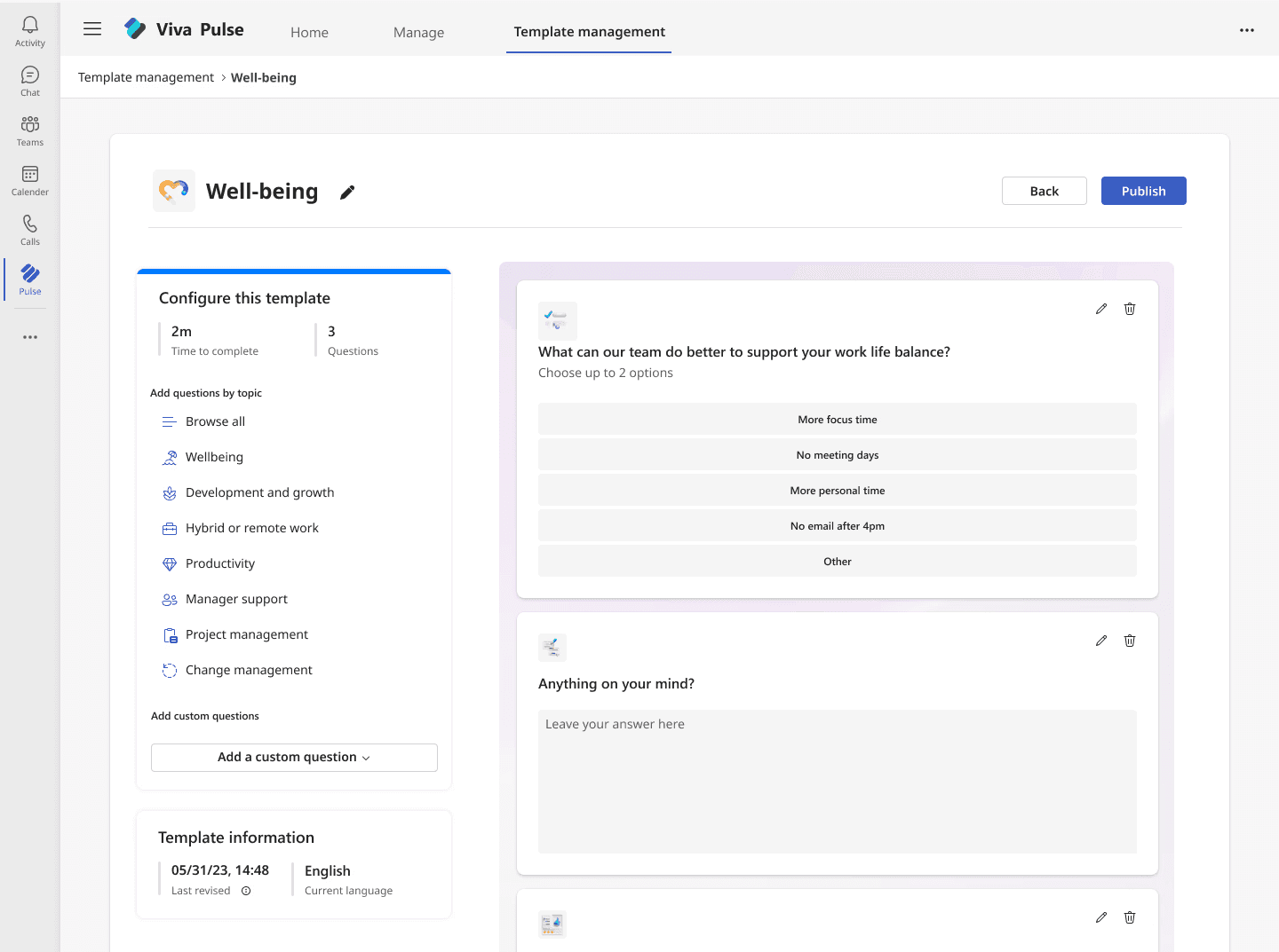
Considering the stakeholder "time to market" goal along with a focus on giving users a familiar design when modifying content, I opted to leverage the existing survey author editing framework rather than starting from scratch, but made a few key updates to align with the primary user (admins)
Update 1 - Revising control panel

This original authoring flow only took into account survey time and length
The original author flow only took into account survey time and length

A template info section was added to help users track edit history and know what language the template would appear in across their organization. The UI was also updated to improve visual hierarchy and distinguish the two sections.
The original author flow only took into account survey time and length
Update 2 - Changing buttons and wizard to match user flow

Authoring a survey had an extra step over creating a template so a wizard as well as a next button to guide the user through the process was necessary
Authoring a survey had one extra step over creating a template so a wizard as well as a next button to guide the user through the process was necessary

Since creating a template in our feature was kept to a two step process, the wizard was removed. Users could also instantly publish a custom survey once they made changes
04. Give the users what they want
Usability tests revealed new insights about collaboration and notifications
Usability tests revealed new insights about collaboration and notifications
After taking the designs through two lightweight review sessions (one with design and one with stakeholders), I made updates based on feedback.
Now it was finally time to test with users!
Usability test insights
While results were mostly positive on overall usability, users did provide a couple interesting insights that hadn't come up when speaking with users previously…
New content notifications
Multiple users wondered how they could announce the publishing of a new survey template to their organization
External collaboration
Users wanted to be able to collaborate simultaneously on drafts as collaboration is often done this way in an external program i.e. a Google doc
05. A balancing act
Time to market kept the project in reality
Time to market kept the project in reality
After getting feedback from users, I was excited to see how I could iterate and incorporate it into the design. Before I put pen to paper (or mouse to mousepad), it was essential to speak with PM and engineering to understand the feasibility of adding these features.
The reality of implementation
After meeting with project PM and engineering folks, it was clear that collaborative drafting and email notifications would take multiple months of engineering effort and investigation.
We now had to weigh the focus on time to market, unblocking app purchase for core customers, and the core user need against the benefit of these additional features and a decision was made to not include drafting or email notifications.
Not being able to include these features in this design phase was a letdown, although I was able to come to a compromise in which engineering would continue their investigation into implementing these features for the second stage of this project.
06. As easy as..
Design hand off
Design hand off
Now that I had aligned with engineering and PM on what we could include in this phase, it was time to complete a couple fit and finish reviews, accessibility specs, and handoff the final design to be built!
Below are the final results:

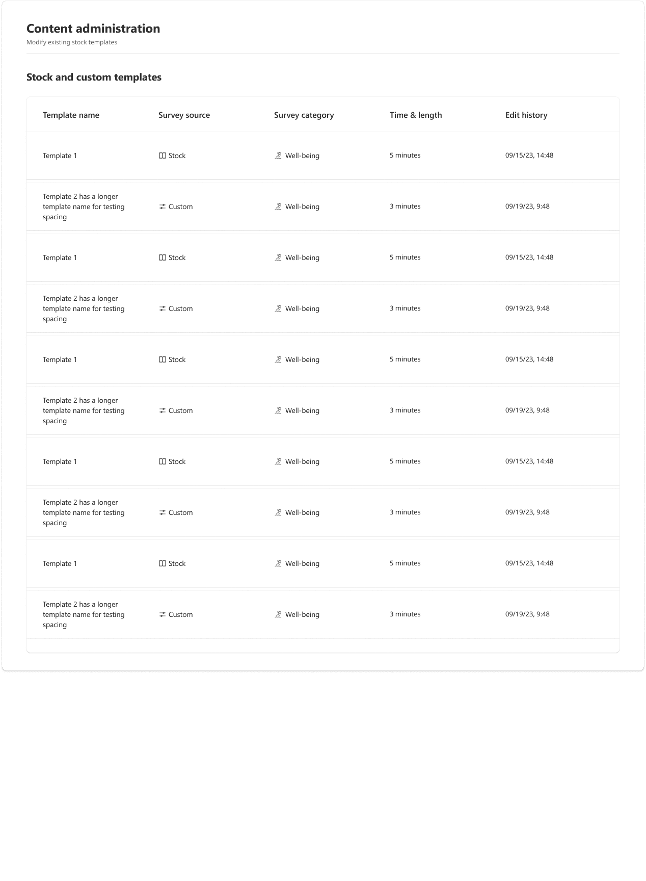
Choose a template to edit
1
1
Users can easily find the template they want and sort by the three columns if needed

Make edits and click
publish
2
A familiar, but updated survey editing design gives users the info they need while reducing the steps between editing and publishing

Confirm publishing
3
… and that's it! Once edits are confirmed, the template will appear for survey authors in the user's organization
Make edits and click publish
2
A familiar, but updated survey editing design gives users the info they need while reducing the steps between editing and publishing


Confirm publishing
3
… and that's it! Users click publish and the template will appear for survey authors in the user's organization
07. Reflections & lessons
Reflections & lessons
Reflections & lessons
Sorry, no punchy title here… I used all my creativity on the last 6 sections!
Jokes aside, thank you for reading this far (or if you scrolled through most of this case study that's okay too, I know you've probably read 20 of these things today).
This project journey was rewarding, not only just because it shipped, but also for its lessons in adaptability, cross-collaboration, and early-project planning.
Below are some moments that stood out to me:
Reflections
Looking back, I would've leveraged a cross-functional MoSCoW-like workshop to better weigh what we view as must haves and should haves and know where to focus our efforts
I feel I could've proposed a better compromise for the drafting feature, perhaps just allowing one user at a time to edit drafts via a lockout/read only system. This may have allowed us to keep a drafting section that multiple users could view at once and be more aligned with user feedback
Lessons
Sometimes (read: often), design requires you to work within constraints and know when to compromise
Project partners also have needs, goals, and motivations that should be considered, just like users
Speaking with stakeholders often can create better alignment and help speed up design
02. A little empathy goes a long way
Journey mapping helped to visualize where users struggle
Gathering insights from users was a valuable step to help create a journey map and illustrate users thoughts, feelings, and experiences on how they currently manage and edit survey content for their organizations
Summarizing the map
Low points
No unified approach to content makes things feel disorganized
Coordination challenges when collaborating
Time is wasted ensuring org-wide content is followed
High points
Authors can edit surveys
Collaboration reduces time to survey creation
Current included survey templates are useful
Surveys are created quickly
Touch points
Users start customizing survey template to align with company values
Users finalize survey content and deploy surveys to their organization
User thoughts
"This template needs to reflect our company's specific requirements."
"How can we ensure the content is followed by everyone?
03. Don't reinvent the wheel
A new dashboard combined with a familiar experience drove the design
User interviews and journey mapping not only helped to learn and then visualize collected insights, but also identify opportunity areas for improvement.
With this knowledge, it was time to move to mid-fidelity designs to better visualize a solution and get feedback from stakeholders
Approaching the initial design
A competitive analysis conducted previously highlighted that content in a table format was the typical pattern for managing survey content.
Using this along with considering Jakob's Law, I was able to choose a design direction that leveraged a mental model users in this space already know.

Taking advantage of existing flows
In addition to a landing page, users also needed a space to modify content.
Considering the stakeholder "time to market" goal along with a focus on giving users a familiar design when modifying content, I opted to leverage the existing survey author editing framework while making a few key updates to align to the user's core goals

The original author flow only took into account survey time and length

A template info section added to help users track edit history and know what language the template would appear in

Authoring a survey had one extra step over creating a template so a wizard as well as a next button to guide the user through the process was necessary
Since creating a template in our feature was kept to a two step process, the wizard was removed. Users could also publish a custom survey once they made changes
04. Give the users what they want
Usability testing revealed useful insights about collaboration and notifications
After taking the designs through two lightweight review sessions (one with design and one with stakeholders), I made updates based on feedback.
Now it was finally time to test with users!
Usability test insights
While results were mostly positive on overall usability, users did provide a couple interesting insights that hadn't come up when speaking with users previously…
New content notifications
Multiple users wondered how they could announce the publishing of a new survey template to their organization
External collaboration
Users wanted to be able to collaborate simultaneously on drafts as collaboration is often done this way in an external program i.e. a Google doc
05. A balancing act
Time to market kept the project in reality
After getting feedback from users, I was excited to see how I could iterate and incorporate it into the design. Before I put pen to paper (or mouse to mousepad), it was essential to speak with PM and engineering to understand the feasibility of adding these features.
The reality of implementation
After meeting with project PM and engineering folks, it was clear that collaborative drafting and email notifications would take multiple months of engineering effort and investigation.
We now had to weigh the focus on time to market, unblocking app purchase for core customers, and the core user need against the benefit of these additional features and a decision was made to not include drafting or email notifications.
Not being able to include these features in this design phase was a letdown, although I was able to come to a compromise in which engineering would continue their investigation into implementing these features for the second stage of this project.
06. As easy as..
Design hand off
Now that I had aligned with engineering and PM on what we could include in this phase, it was time to complete a couple fit and finish reviews, accessibility specs, and handoff the final design to be built!
Below are the final results:
Choose a template to edit
1
Users can easily find the template they want and sort by the three columns if needed
Make edits and click
publish
2
A familiar, but updated survey editing design gives users the info they need while reducing the steps between editing and publishing
Confirm publishing
3
… and that's it! Once edits are confirmed, the template will appear for survey authors in the user's organization
07. Reflections & lessons
Reflections & lessons
Oh, did you expect another punchy title? I'm sorry, I used all my creativity on the last 6 sections!
Jokes aside, thank you for reading this far (or if you scrolled through most of this case study that's okay too, I know you've probably read 20 of these things today).
This project journey was rewarding, not only just because it shipped, but also for its lessons in adaptability, cross-collaboration, and early-project planning.
Below are some moments that stood out to me:
Reflections
Looking back, I would've leveraged a cross-functional MoSCoW-like workshop to better weigh what we view as must haves and should haves and know where to focus our efforts
I feel I could've proposed a better compromise for the drafting feature, perhaps just allowing one user at a time to view drafts via a lockout system. This may have allowed us to keep a drafting section and be aligned with user feedback
Lessons
Sometimes (read: often), design requires you to work within constraints and know when to compromise
Project partners also have needs, goals, and motivations that should be considered, just like users
Speaking with stakeholders often can create better alignment and help speed up design
01. Keep your users close
Users were reluctant to adopt Pulse
Based on previous feedback, current users were reluctant to adopt Pulse without the ability to control and customize org-wide survey content
Our hypothesis
We believed that allowing for deeper customization would support users' longer-term adoption of the product.
Talking to customers
To verify our hypothesis, we interviewed our current users/customers to gain insights and understand more about who they are and their needs as HR Admins.
“ I wish we could make templates our own to allow managers to select something that's been thought through on our side. ”
“ I wish we could make templates our own to allow managers to select something that's been thought through on our side. ”
Pulse user, HR Admin
Pulse user, HR Admin