A rework of Pulse's existing usage dashboard
Rethinking the data visualization experience in Pulse
COMPANY
Microsoft
ROLE
Lead Designer
Duration
3 months
Team members
1 PM, 2 Engineers

Summary
Pulse's usage dashboard is an admin-level data tool that helps users understand how Pulse is being used within their organization.
As the lead and sole designer on this project, I leveraged customer feedback to create targeted improvement to the existing dashboard. The updated design gave users additional requested metrics and centered the dashboard around taking action on insights.
Results
20% increase in survey response rates
Users
IT Admins
HR Admins
01. Users want more
The existing experience was missing the mark for users

This MVP version was falling short of what users needed due limited available data and lack of actionable guidance
Auditing customer feedback
I started by auditing feedback submissions from users to understand their frustrations and needs. This quote represented how most users seemed to be feeling:
" The metrics help only at a surface level, I can't do much with it… "
02. Teamwork makes the product work
User interviews + Collaborative sessions created strong team alignment
To start, I conducted user interviews to get a deeper sense of user's current pain points with the dashboard
Key user frustrations learned from interviews
Leveraging a 6-person user interview, I identified core frustrations users were experiencing with the current product.
1
Data dead-ends
Users are unable to close the loop on insights they see or they do not have the metrics they need
2
External action agitation
The added work from having to go outside the dashboard to view or parse metrics
3
Overly broad data
Data provided is too broad and can’t be applied effectively to smaller groups
Framing the problem and identifying goals
So I finished up user interviews and now I had all of this qualitative data… But what was I supposed to do with it?
First, I setup a collaborative session with my PM and engineering partners that would progress through generating HMWs to frame the problem for users and then help us establish goals to focus on.
An alignment on our goals and design direction
This workshop was impactful as it helped us to define and refine user and business goals and align on early design direction

03. First pass on high-fidelity designs
Alignment on goals and features created a smooth transition into design
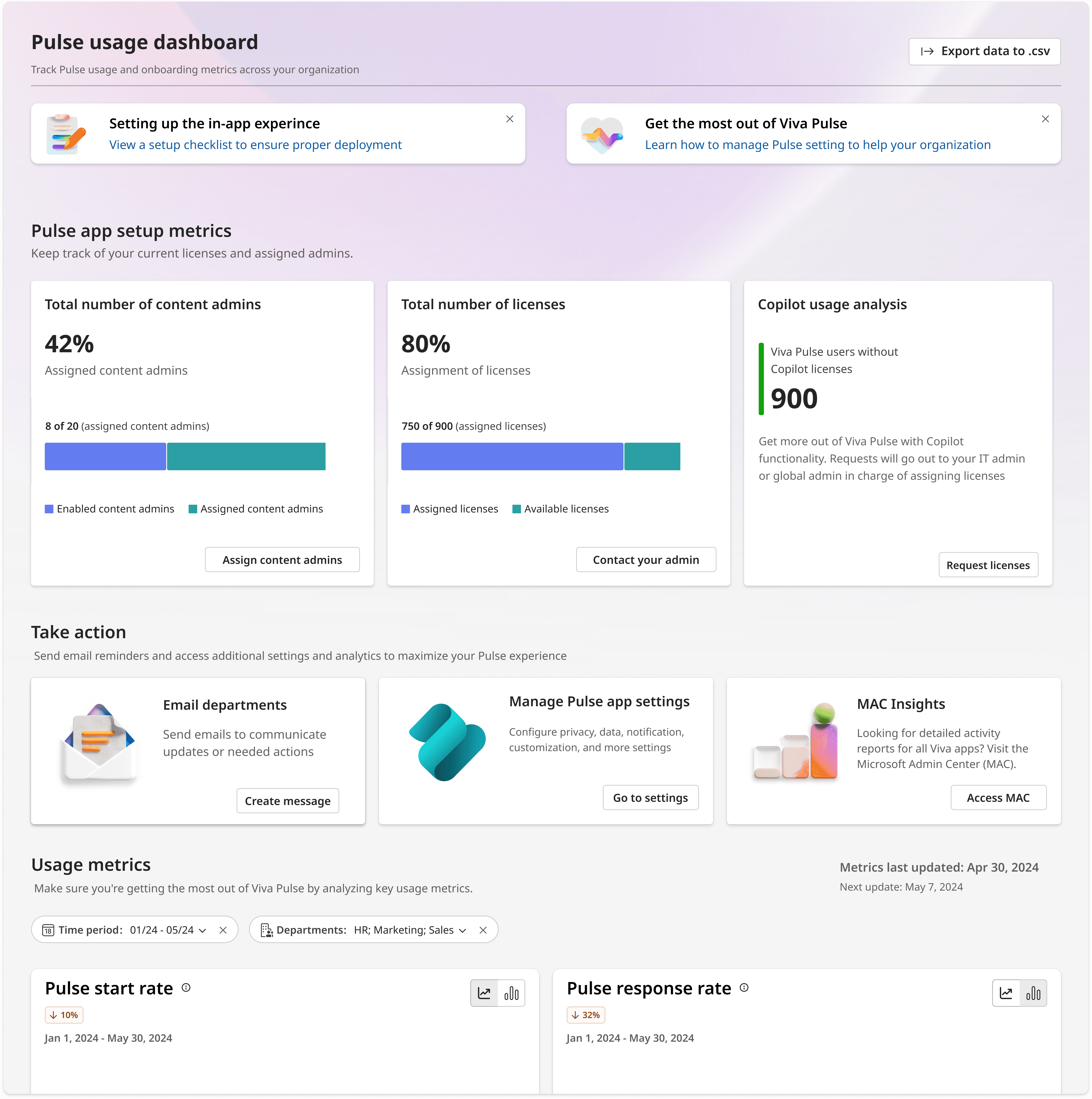
With alignment on design direction and the goals the team wanted to focus on, I moved into wireframes and then onto a high-fidelity design to take through user testing.
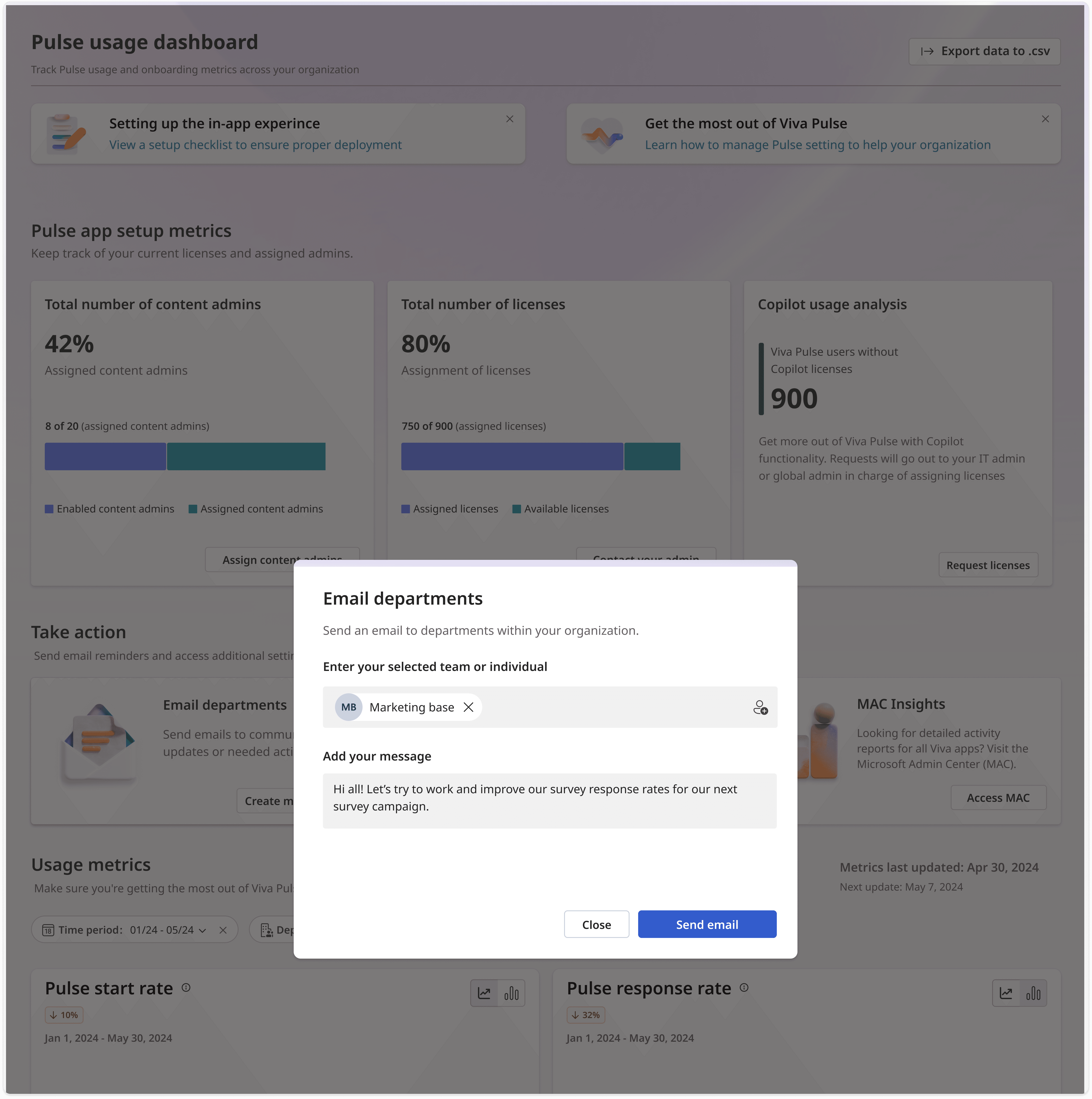
First high-fidelity iteration breakdown
04. Pivot
User testing revealed that Users felt the in-app email wouldn't help
Back to the drawing board
Through low-fidelity designs, I explored a few different ideas that would provide more targeted actions for users while keeping things simple and confirming with engineering that any ideas would be technically and timeline feasible
Lightweight testing of the new designs
I ran lightweight tests using clickable versions of three different ideas in front of users.
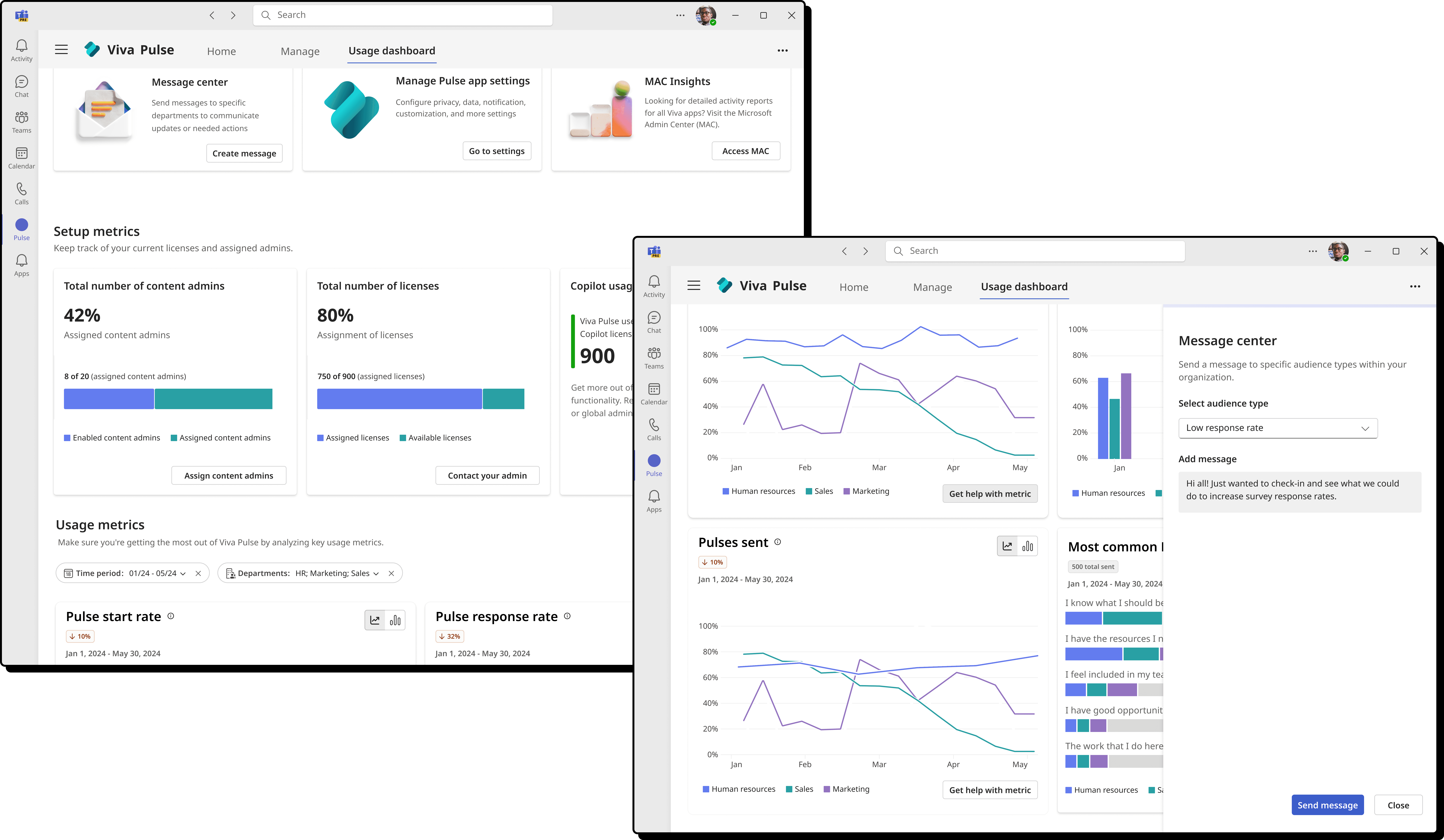
Feedback was the most positive on a design that allowed users to pick audience grouped by response rate level and write a message to them.
Shift in design visualized
This update would allow users to target specific audiences, for example, those that fell under a "Low response rate", and also leveraged a design that would keep them more within the experience
05. Final dashboard design
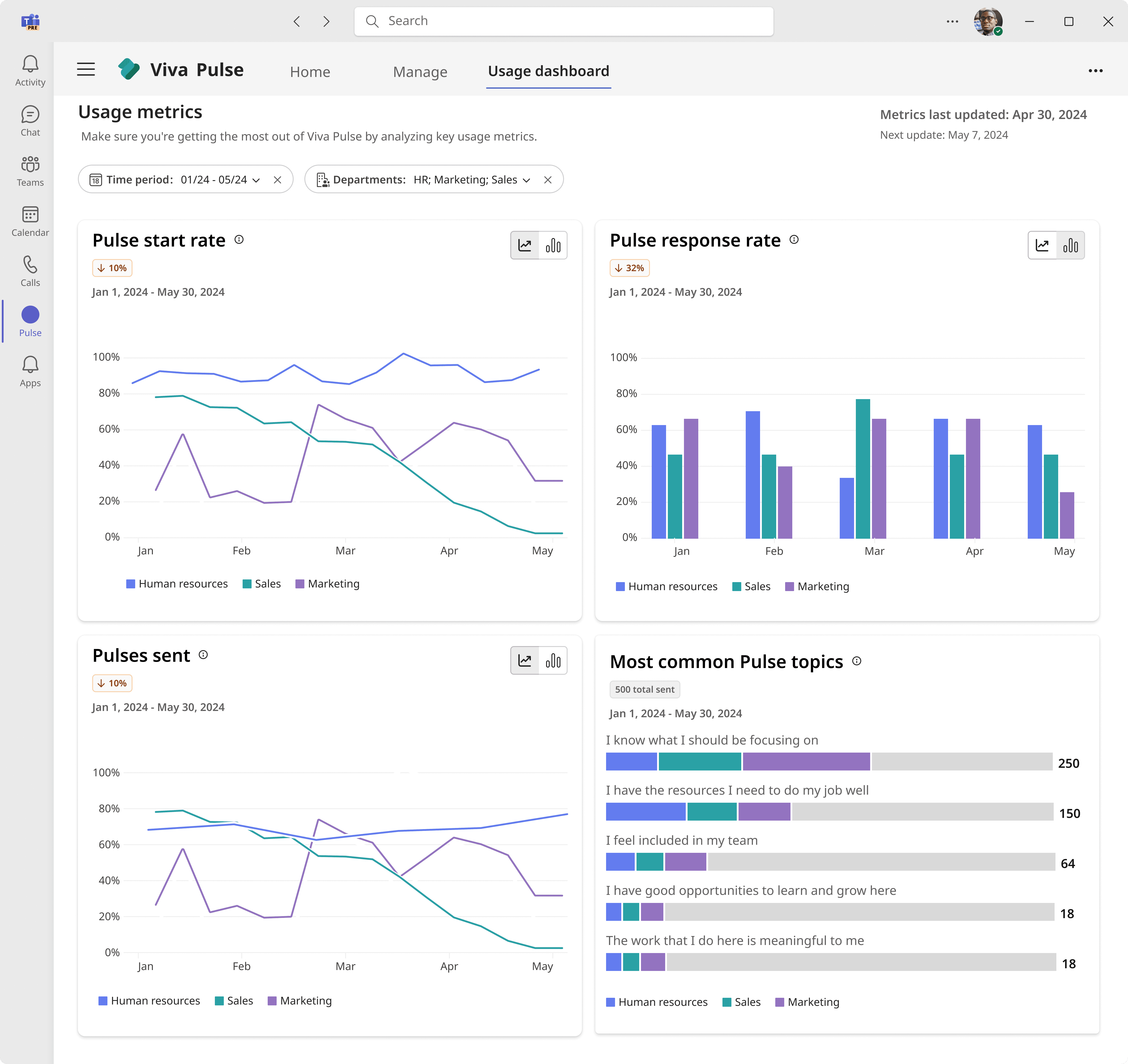
The shipped design that helped boost user engagement
After implementing updates from usability testing, I was able to put together a final prototype and get final buy in from all stakeholders… and soon after, a new dashboard rolled out to users!


06. did it work?
design outcomes
Leveraging metrics that product, engineering, and I had partnered together to determine how to measure success post-launch as well as user satisfaction surveys and feedback submissions, we felt the launch was (mostly) a success!
20%
Response rate increase
Of 40 random users surveyed, a reported 20% increase on average in user engagement at their orgs
-5%
Drop in external actions
Less users were relying on external actions such as data export, however this number could be still be improved
Project lessons
Thank you for reading through this case study! Below I've shared a couple of moments that felt worth reflecting on from this project:
Missing the mark and adapting
Despite having data going into the design, you might not always get what users were hoping to solve the problem.
I learned to validate designs with users at multiple stages if possible and how to best adapt while including cross-functional partners if there is a need to pivot the design.
Collaborative sessions
Running a collaborative session with project partners is a fast and effective tool for gaining alignment. I learned a lot about how to get a good ROI from the time spent and how to make the most out of the outcomes.
Next step - investigating additional external actions users take
Due to the lower than unexpected drop in external actions done by users, the next steps for this project would be talking to users to drill down further on what specific actions users take outside of the dashboard. Then, determine how those actions can be better incorporated.


